
BIG BANG BIG BOOM - the new wall-painted animation by BLU from blu on Vimeo.
Showing posts with label Art. Show all posts
Showing posts with label Art. Show all posts
November 10, 2010
The best record of the year, hands down!
The story behind this album can be found everywhere, so I won't even bother. It's THE BOSS, so you know it's perfect from the get go. But check out this packaging. It gets 7 out of 5 stars according to my own private graphic nerd rating system.
(Oh, and here is a very interesting story about the cover photo. Nerd alert, again.)
July 27, 2010
"I had covered most of the house with paint and ink" - An interview with Adrian Landon Brooks

I discovered Adrian Landon Brooks' art by sheer accident. Must have been on Myspace or something, which is ("this is sooo 2007!") pretty an old school thing by now. Myspace has become a zombie of bits and bytes in the meantime, Adrian's profile does not exist anymore, but somehow I have always been following his art... because this is the nature of art: it touches you, whether you see it in a gallery, on the streets, in a book, or even on the fucking internet.
What made you realize "wow, I can be an artist and be taken seriously"?
I started off painting graffiti all through out my teenage years, and got a job installing work at a gallery in Houston,TX. The owner of the gallery encouraged me to broaden my horizons, and that led to me exploring ink drawings. As the drawings progressed, I had a few key people in my life at the time that kept encouraging me to push my limits. When I had a body of rough work, I was offered a spot in a group show at a local warehouse gallery named "one ten". The experience of watching people interact with my work really opened my eyes and gave me some confidence that I had otherwise been lacking.
 "Silver Jew" - water color on wood panel, 11" x 6 1/2 "
 Who were these "key people"and what did they do?
When I was 19 or so, I was living in a dilapidated rental house with two of my close friends in Houston. We had a dining room and a huge garage that nobody was using, so I kinda took over both with all my scrawling ink drawings, and the beginning of some actual paintings. My roommates would give me constant feedback and comment on the mess I was creating daily. By the end of the lease, I had covered most of the house with paint and ink. That year shaped my work a lot. I also began a romantic relationship that same year and subsequently made portraits of her for the next few years. I owe those times and people a lot.
"The experience of watching people interact with my work really opened my eyes" - give an example!
I specifically remember selling a small drawing for 20 bucks at the first group show I was a part of, and being blown away with how happy this guy was to take it home. It really meant a lot to know my work could have such a positive effect on someone, even though it was pretty dark material at the time.
Speaking of happiness, what keeps you sane?
I would say my mother and art binges. I usually make a group of work all at once over the course of a few weeks. I seem to enjoy the purging process a lot more than making little things every day. When you work on a piece for 12 hours straight, you definitely experience a type of euphoria I haven't been able to find from any drug.

What inspires you to create art on a daily basis?
Pretty much anything you can think of really. I get inspired by music pretty often, or just a specific line from a song that hits me hard one day. Some of the one liners in my work are borrowed from some of my favorite songs. I think if a piece of music is capable of moving me, I should pay homage to it with my own creation.
Music... you have a Jawbreaker tattoo. What else rocks your world?
Haha, I got that tattoo when I was 17. I can safely say that Jawbreaker shaped a good part of my youth. 24 Hour Revenge Therapy will never get old. I have been listening to Timber Timbre and Phosphorescent a lot lately. I usually gravitate towards sad bastard music.
How, well... "fitting" - your art is not particularly lighthearted or happy per se... where does that come from?
I think I find the most inspiration or motivation from the darker side of things. It's not that I am an unhappy person, but I think sorrowful content is a little more interesting. I try to break up the melodrama with words - it's a way of bringing my issues to light, and realizing that I don't have it so bad. I think it's good to be able to poke fun at yourself.

More art can be found here: www.adrianlandonbrooks.com ... support!
June 27, 2010
The worst record covers of all times, part two
 Well, I have to admit that it isn't the best idea I have ever had to make the 12 or so readers of this blog go blind. But then again, what should I do? I own this record. And I just can't bear this pain on my own. Please help me.
This record and this cover are so awesome on so many levels. One, it's not a "single", it's an EP. Four songs. That was unheard of back then! Two, it's not only four songs, it's four DRINKING SONGS. For better or worse. I am still a bit in doubt whether or not these are songs you should listen to while you are drinking (to enhance the liquid experience), or songs you just can't stand listening to while you're sober. I'll leave this up to you, dear reader. Judge for yourself.
But this is about the cover, not the music. This dude is the textbook definition of awesome: part Red Dawn, part King Diamond. Oh, hold on a second... must... gasp... for... breath...
Two things about this cover will poke your eye immediately: the teeth and the Spar logo. Now I don't really know what the fuck is up with that logo, but it definitely is an interesting thought that this piece of "music" was a giveaway by the world's largest food retailer. But where the fuck did they display this? In the wine section? Special offer: buy two bottles of vodka, get a vinyl seven inch for free? We'll never know.
Anyway, I would love to get a free seven inch when I go shopping for groceries. It would make a song I love come to life again.
June 24, 2010
The worst record covers of all times, part one
 Now I know that are quite some websites dedicated to the art of the album cover, like this or that, but as far as I know, no one has ever posted this visual atrocity. Sit back, open the image in a new browser window, and gasp for breath. Yes, this is serious!
It's only half as "funny" if you don't understand German, because the song titles make it even better. And no, I'm sorry, I just CAN'T translate it. The second song, "Wüst oder wüst ned" is a overlooked and long forgotten gem of Austropop. Even if you don't get the lyrics, it's worth a mouseclick... because... because... it's a fucking Sirtaki song, and I AM NOT MAKING THIS UP!
It's a song about drinking with a girl, supposedly giving her the time to make up her mind (about whatever, the author is being unclear about this), and looking for the toilet in the meantime. And while the story itself is scary and weird enough, please take another look at the cover. The person who sings this song is the one on the left, some kind of Austrian semi-celebrity. So, uhm well. But who the fuck is the one on the right? Shit, that dude's scary! And by "scary", I mean BIG TIME SCARY.
So, dear blog reader, whoever you are - enjoy this post like you would enjoy driving past a car accident on the highway. You can thank me later. Me, I will go and see Kim Wilde and Billy Idol tonight. For free. It's gonna be fun, in an Accüsed kinda way...
March 26, 2010
Unveiling the wicked (like the title of that Exciter record)
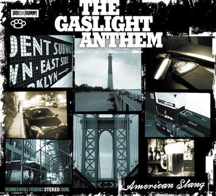
A few days ago, the Side One Dummy website read that the artwork for the new Gaslight Anthem album had been "unveiled", and I was already skeptical. Unveiled?! What the fuck? A long lost Van Gogh painting? Or even a new Banksy piece? Either way, I figured, it must be special...
And yes, it is special indeed. "Special" in a Special Olympics way.

All right, I am the first to admit that the artwork for The '59 Sound was one giant step forward from the visual atrocity known as Sink Or Swim. And let's not forget that Señor and the Queen looks fucking awesome... (That said, please check out www.giantsquidletterpress.com for a lot of really amazing letterpress artwork!) So well, yes, this band had developed a really strong visual identity over the years, one that even I could enjoy.
But let's be honest, the new cover... ouch! I actually like the idea, but that's where it ends. Maybe the only good thing I can say about it is that it was quite smart to use the same typeface as on '59 again. What totally ruins it is that white border around everything... it looks like some World of Warcraft playing douchebag from the Gaslight Anthem's bible group came up with the concept of making the record look "used" and "old", but one Photoshop lesson after sunday school just wasn't enough to pull it off. Seriously, it's looking putting this picture on top of that cover. Why not poop on it?
(Please excuse me for a moment... must... empty... stomach...)
On with the sweetness, baby! The album title in that black box on the bottom corner... what's that? Did you forget to add it in your 72 DPI preview file? I am not even mentioning the arrangement of the photos here. It wouldn't take any amputee who has to click the mouse with his toes longer than let's say ten minutes to crop them properly!
But the cream of the crap (oops, crop, I mean...) is the knuckle duster right under the label logo. I am not even blaming the graphic "designer" here, maybe it was just a smart business move. "Dude, well, you know, dude, we need to expand our target audience... let's not forget our old fans. You know, dude, that chick in Poophole, Ohio, was all over me... I want her to buy the record at Hot Topic!" NO! NO! NO! What's next then? Girlie shirts in XS that are flexible enough to fit a whale if stretched properly?
Dear whoever-did-this-cover, I would love to meet you and shake your hand. You must be a fucking genius. Not when it comes to graphic design, sorry, but I'm sure you got a big bag full of money to commit offense to all my sensiblities, and that makes you one hell of a business man. Oh, and by the way, you owe me a meal. The one I had today wouldn't remain in my belly.
And yes, it is special indeed. "Special" in a Special Olympics way.
All right, I am the first to admit that the artwork for The '59 Sound was one giant step forward from the visual atrocity known as Sink Or Swim. And let's not forget that Señor and the Queen looks fucking awesome... (That said, please check out www.giantsquidletterpress.com for a lot of really amazing letterpress artwork!) So well, yes, this band had developed a really strong visual identity over the years, one that even I could enjoy.
But let's be honest, the new cover... ouch! I actually like the idea, but that's where it ends. Maybe the only good thing I can say about it is that it was quite smart to use the same typeface as on '59 again. What totally ruins it is that white border around everything... it looks like some World of Warcraft playing douchebag from the Gaslight Anthem's bible group came up with the concept of making the record look "used" and "old", but one Photoshop lesson after sunday school just wasn't enough to pull it off. Seriously, it's looking putting this picture on top of that cover. Why not poop on it?
(Please excuse me for a moment... must... empty... stomach...)
On with the sweetness, baby! The album title in that black box on the bottom corner... what's that? Did you forget to add it in your 72 DPI preview file? I am not even mentioning the arrangement of the photos here. It wouldn't take any amputee who has to click the mouse with his toes longer than let's say ten minutes to crop them properly!
But the cream of the crap (oops, crop, I mean...) is the knuckle duster right under the label logo. I am not even blaming the graphic "designer" here, maybe it was just a smart business move. "Dude, well, you know, dude, we need to expand our target audience... let's not forget our old fans. You know, dude, that chick in Poophole, Ohio, was all over me... I want her to buy the record at Hot Topic!" NO! NO! NO! What's next then? Girlie shirts in XS that are flexible enough to fit a whale if stretched properly?
Dear whoever-did-this-cover, I would love to meet you and shake your hand. You must be a fucking genius. Not when it comes to graphic design, sorry, but I'm sure you got a big bag full of money to commit offense to all my sensiblities, and that makes you one hell of a business man. Oh, and by the way, you owe me a meal. The one I had today wouldn't remain in my belly.
February 4, 2009
There is no place for irony in heavy metal, part one
In a time when every Vice Magazine reading asshole thinks it's hip and cool to wear cock rock band t-shirts for the sake of some misunderstood irony, it's time to raise the flag of hate again. Metal always was, still is, and will forever be the greatest fucking musical genre on earth ever. Period. I mean it.
So, dear fellow headbangers, put on your sleeveless denim jackets, ride your battle horse into glory, turn the fucking volume all the way up and have a look at some of the greatest moments in art history with GLW/DRK...
W.A.S.P. - Animal 12"
 All right, everybody - never ever disrespect W.A.S.P.! I mean it. You might shrug it off as just my opinion, but trying to argue with me that W.A.S.P. is not one of the greatest bands of all time might result in a massacre. What's not to love about them? Blackie Lawless even replaced Johnny Thunders in the fucking New York Dolls (for a few days only, but still...) This is way cooler than your lame hardcore band will ever be, no doubt. And any band that has a debut single like Animal just flat out rules. Period.
But let's take a look at the cover, shall we? One thing that immediately catches your attention is the lettering that was used for the title. It's exactly the same font as on the cover of NWA's Straight Outta Compton, and if you ask me, this is cooler than Vanilla Ice and MC Hammer together. I also love the fact that the title says "F**k Like A Beast". That's like flipping the bird to the moral majority. "You're not gonna let us print the word fuck on our own cover, you posers? Well, we're gonna use the picture of a man in tights instead, and we're gonna put a bloody sawblade on his private parts. That's how heavy we are, Tipper Gore!" The band logo is a wonderful example of heavy metal typography: it looks like four pieces of metal with screws. And fuck it, who cares about tracking and letter spacing? This piece of modern art was created years before desktop publishing software became widely available, so the sawblade between two letters and painfully varying spaces are a-ok.
(On a side note, does it really say "mum" on his belly, written in blood? How metal would that be?)
Exciter - Heavy Metal Maniac
 What we have here is one of the most underrated albums ever. It's basically their demo pressed on vinyl, and that was when bands still did demos with 9 songs and spread them all over the world on tape, instead of recording one lame track and putting it on MySpace. Exciter was a speed metal trio from Canada, with a drummer who also handled the vocal duties - a concept that was later utilized by Snuff and Satanic Surfers, but none of these bands were even remotely metal (despite the word "satanic" in one name).
The cover sums up the title perfectly. Just look at the man's arm! He's got a heart tattoo with a banner around it that actually reads "metal". You just have to be a true heavy metal maniac to get some sweet ink like this. Talk about being down for life! Even though my initial assumption was that the person in the picture is someone who auditioned for the Village People, the credits on the back cover tell us that this is the arm of someone called the "East Side Slasher". No matter how you look at it, it's awesome. I would kill to hang around with someone called East Side Slasher. "Hey East Side Slasher, want another beer?" But maybe the East Side Slasher really did audition for the Village People. It would explain a lot: (a) his semi-gay leather biker bar outfit, and (b) the act of violence he commits to the Marshall amp. After all, he cuts a pussy into that amp. An act of retaliation maybe? The Village People were never known to be as heterosexual as let's say the 2 Live Crew, so who knows...
Pokolgép - Pokoli Színjáték
 Ladies and gentlemen, fellow metalheads, and now... the most amazing metal cover of all time. Ever.
Even though I don't know shit about Pokolgép (which means "hell machine", or more loosely translated just some random piece of explosive device), I just had to pick this up at the flea market. It was super cheap, I had seen Pokolgép tapes all over the place when I was on holidays in Hungary as a kid, and nothing screams m-e-t-a-l! like the cover artwork. Come on, just look at the logo! Chains and metal, just what a true headbanger at heart needs... and don't forget the reflections. This was done in 1987 with Eastern European crayons, and Adobe has not been able to come up with a Photoshop filter like this until now. Pure genius.
But let's check out the little details that add to the overall greatness of this masterpiece...
1. The monster-robot (or whatever the fuck this is supposed to be) is apparently holding a baseball bat, which is way ahead of it's time. It's almost prophetic: bands like Biohazard or Madball were doing this years later.
2. The rings! Four of 'em! Two skulls, one happy devil with a Rolling Stones tongue (pop-cultural cross references, anyone?), and a sad devil. That's like Yin and Yang in a heavy metal kind of way. To make the whole imagery even more metal, one skull has not two but three rows of teeth, and the sad devil even has four. Really, count them. Can you get any heavier? Maybe this is some kind of social criticism that I don't get, but please keep in mind that Hungary offers some of the best and cheapest dental services on the face of this earth.
3. I love the robot's helmet. It has (a) two horns (to make it look more diabolical), (b) it says 666 (even more evil!), (c) it looks a bit like the Motörhead war pig logo (another reference), and (d) the helmet is either cracked and shattered from battling other demons, or the artist was going for a bio-mechanic look, trying to add veins. I don't know what's cooler.
4. I can't stop to sing the praise of this amazing artist. His name is Giorgio Soós. Does he have any books of his artwork available? When's his next solo exhibition? Seriously, this guy was a true visionary. Everybody rips of Shepard Fairey these days, or Pushed, or even me - but let me enlighten you. I am sure you haven't noticed until now. Take a close look at the robot's face. See? It's fucking MF Doom's metal mask! More than a decade ago! (And Sido ripped off that shit even later.)
Flotsam and Jetsam - Doomsday For The Deceiver
 Holy fuck, now this is an all-time classic, both musically and visually. In case you didn't know (which would make you a wimp and a poser), Jason Newsted played bass on this album, before he was chosen to replace Cliff Burton in the band that should have broken up after ...And Justice For All. But historical details aside, what rules about this album (apart from the über-metal riff-o-rama, of course!) is the wonderful front cover artwork.
It's one hell of a epic battle scene: Scuzzlebutt from South Park versus the funny little devil from Maiden's Number Of The Beast cover! This is heavier than Rocky versus Mr T, or Luke Skywalker versus Darth Vader, and perhaps even Jack Bauer versus everyone. I have a few minor complaints about the cover, though. Scuzzlebut (a) is green instead of brown, (b) doesn't have Patrick Duffy for a leg, and (c) there's no piece of celery for his right hand. But I can see past the last mistake, because random vegetables are just not as evil as reptile claws. And could you rip out somebody's eye with celery? Probably not, unless you are Jack Bauer. Or maybe these two cuties are just playing, and Scuzzlebutt played a little bit too rough? We'll never know. Maybe the devil just didn't like the wicker baskets Scuzzlebutt was weaving, which would make him the deceiver. About time his doomsday is here! Boo! As an extra added bonus, I'm sure it hasn't slipped past your experienced art critic eye that this battle of epic proportions takes place on the corner of Flotsam and Jetsam Street or Avenue or something or other.
(Reading the lyrics to the title track, I actually found out that it's not Scuzzlebutt, but another fine gentleman called Flotzilla. He even had his own EP after this album. Wow, cool.)
Subscribe to:
Posts (Atom)
